This project on GitHub: https://github.com/alexcrist/beatbot
This document but with code: https://alexcrist.github.io/beatbot/code.html
🎧 Beatbot
A personal project by Alex Crist
What if you could beatbox into an app that could translate the audio into real drum sounds?
From Siri to Google Assistant, a handful of applications have explored and mastered the speech processing problem. The push for these pieces of software has resulted in a wealth of knowledge on the topic from blog posts to academic papers.
In the wake of these algorithms comes Beatbot, a beatbox to drum translator that uses documented speech processing techniques along with some novel strategies to process beatboxing audio.
Here are a few examples of what it can do.
📼 Examples
import IPython
# Display helper
def display_before_and_after(label, before_file, after_file):
IPython.display.display(IPython.display.Markdown('### ' + label))
IPython.display.display(IPython.display.Markdown('#### Before'))
IPython.display.display(IPython.display.Audio(before_file))
IPython.display.display(IPython.display.Markdown('#### After'))
IPython.display.display(IPython.display.Audio(after_file))
display_before_and_after(
'Example 1 (easy)',
'assets/input_audio/beatbox_1.wav',
'assets/output_audio/drum_track_1.wav'
)
display_before_and_after(
'Example 2 (easy)',
'assets/input_audio/beatbox_2.wav',
'assets/output_audio/drum_track_2.wav'
)
display_before_and_after(
'Example 3 (hard)',
'assets/input_audio/beatbox_3.wav',
'assets/output_audio/drum_track_3.wav'
)
display_before_and_after(
'Example 4 (hard)',
'assets/input_audio/beatbox_4.wav',
'assets/output_audio/drum_track_4.wav'
)
Pretty neat! Now let's see how Beatbot works behind the scenes.
🔮 How Beatbot Works
Beatbot operates in three steps:
- First, it locates all of the beatbox sounds in the audio
- Next, it classifies which sounds are which
- And finally, it replaces the beatbox sounds with similar sounding drums
🔬 Part 1: Beat location
The first step in Beatbot is to locate the starts and end of each beatbox sound.
Let's start out by taking another look at the input audio from Example 1.
import librosa
from utils import plot_utils
%matplotlib inline
BEATBOX_AUDIO_FILE = 'assets/input_audio/beatbox_1.wav'
# Load audio
audio, sample_rate = librosa.load(BEATBOX_AUDIO_FILE, mono=True)
# Plot
plot_utils.plot(y=audio, title='Beatbox audio', xlabel='Time (samples)', ylabel='Amplitude')
# Display audio player
IPython.display.Audio(BEATBOX_AUDIO_FILE)

Visually, we can already begin to see where the beats are located, but this raw waveform isn't good enough. Certain loud noises don't register as large amplitude spikes while certain quiet noises do.
To get a get a cleaner representation of the audio's loudness, we'll start by taking a look at the the frequencies of the audio over time.
We'll do this by applying the Fourier transform to small, overlapping windows of our audio wave.
import numpy as np
# Windows of audio 23ms long with 12ms of overlap
WINDOW_SIZE = 512
WINDOW_OVERLAP = 256
# Take the 'short time' Fourier transform of the audio signal
spectrogram = librosa.stft(y=audio, n_fft=WINDOW_SIZE, win_length=WINDOW_SIZE, hop_length=WINDOW_OVERLAP)
# Convert imaginary numbers to real numbers
spectrogram = np.abs(spectrogram)
# Convert from Hz to Mel frequency scale
mel_basis = librosa.filters.mel(sample_rate, WINDOW_SIZE)
spectrogram = np.dot(mel_basis, spectrogram)
# Convert from amplitude to decibels
spectrogram = librosa.amplitude_to_db(spectrogram)
# Plot
plot_utils.heatmap(data=spectrogram, title='Spectrogram', xlabel='Time (windows)', ylabel='Frequencies')

In this visualization, known as a spectrogram, we can clearly see where each beat is located. Yellower colors indicate loudness while bluer colors indicate quietness. Positions near the top represent high frequencies, while lower positions represent low frequencies.
To determine the loudness of our audio at any point, we just need to add up all the yellow energy in a given time column.
# Sum the spectrogram by column
volume = np.sum(spectrogram, axis=0)
# Plot
plot_utils.plot(volume, title='Audio volume', xlabel='Time (windows)', ylabel='Volume (decibels)')

Summing our spectrogram by column gives us the volume of the beatbox track over time.
We now can see clear peaks at each beatbox sound.
We'll now use a simple peak finding algorithm to determine how may peaks exist at each prominence value from zero to the largest peak prominence.
This approach will give us the flexibility to use Beatbot on tracks with varying volume.
import scipy
import matplotlib.pyplot as plt
MIN_PROMINENCE = 0
MAX_PROMINENCE = np.max(volume) - np.min(volume)
NUM_PROMINENCES = 1000
# Create an array of prominence values
prominences = np.linspace(MIN_PROMINENCE, MAX_PROMINENCE, NUM_PROMINENCES)
# For each prominence value, calculate the # of peaks of at least that prominence
num_peaks = []
for prominence in prominences:
peak_data = scipy.signal.find_peaks(volume, prominence=prominence)
num_peaks.append(len(peak_data[0]))
# Calculate the most frequent peak quantity
most_frequent_num_peaks = np.argmax(np.bincount(num_peaks))
#Plot
plot_utils.plot(
x=prominences,
y=num_peaks,
title='Number of peaks per prominence',
xlabel='Minimum peak prominence (decibels)',
ylabel='Number of peaks',
show_yticks=True,
show=False
)
line = plt.axhline(most_frequent_num_peaks, c='green', ls=':')
plt.legend([line], ['Most frequent number of peaks = 33'], fontsize=14)
plt.show()

The above graph shows how the number of peaks found changes as the required peak prominence is set at different values between zero and our maximum.
In the middle of this graph, an unusually long flat section exists where the number of found peaks does not change as the minimum peak prominence increases.
This flat zone indicates that those 33 peaks are the most significant in the volume signal.
# Define the starts and ends of peak to be the intersection of 70% of the peak's prominence
PROMINENCE_MEASURING_POINT = 0.7
# Get a prominence value for which there are 33 peaks
prominence_index = np.where(np.array(num_peaks) == most_frequent_num_peaks)[0][0]
prominence = prominences[prominence_index]
# Calculate starts and ends of each peak
peak_data = scipy.signal.find_peaks(volume, prominence=prominence, width=0, rel_height=PROMINENCE_MEASURING_POINT)
peak_starts = peak_data[1]['left_ips']
peak_ends = peak_data[1]['right_ips']
# Plot
plot_utils.plot(volume, title='Audio volume', xlabel='Time (windows)', ylabel='Volume (decibels)', show=False)
for peak_start, peak_end in zip(peak_starts, peak_ends):
beat_start = plt.axvline(peak_start, c='green', alpha=0.5, ls='--')
beat_end = plt.axvline(peak_end, c='red', alpha=0.5, ls='--')
plt.legend([beat_start, beat_end], ['Beat start', 'Beat end'], fontsize=14, framealpha=1, loc='upper right')
plt.show()

For each of our 33 peaks, we now obtain the start and end locations by moving left and right from the peaks' tips until we intersect 70% of each peak's prominence.
The value 70% was chosen through trial and error.
# Scale up peak starts and ends
beat_starts = librosa.frames_to_samples(peak_starts, hop_length=WINDOW_OVERLAP)
beat_ends = librosa.frames_to_samples(peak_ends, hop_length=WINDOW_OVERLAP)
# Plot
plot_utils.plot(y=audio, title='Beatbox audio', xlabel='Time (samples)', ylabel='Amplitude', show=False)
for beat_start, beat_end in zip(beat_starts, beat_ends):
start_line = plt.axvline(beat_start, c='green', alpha=0.5, ls='--')
end_line = plt.axvline(beat_end, c='red', alpha=0.5, ls='--')
plt.legend([start_line, end_line], ['Beat start', 'Beat end'], fontsize=14, framealpha=1)
plt.show()

And finally, here are our beats' starts and ends overlayed onto the orginal audio signal.
🌌 Part II: Beat classification
Now that we've found the locations of all of the beats in the track, we need to determine which beats are which.
To start off, let's look at each beat.
from utils import multi_plot_utils
# Extract beats' audio
beats = []
for beat_start, beat_end in zip(beat_starts, beat_ends):
beat = audio[beat_start:beat_end]
beats.append(beat)
# Plot
multi_plot_utils.multi_plot(beats, title='Beats')
# Also here's the audio if you want to listen again
IPython.display.Audio(BEATBOX_AUDIO_FILE)

Listening to the audio again, our expected beat classification should be:
0 1 1 12 1 1 11 1 0 12 1 1 10 1 1 12 1 1 11 1 0 12 1 1 13Where:
0= "pft"1= "tss"2= "khh"3= Unintentional knockLet's visualize this.
EXPECTED_PATTERN = [0, 1, 1, 1, 2, 1, 1, 1, 1, 1, 0, 1, 2, 1, 1, 1, 0, 1, 1, 1, 2, 1, 1, 1, 1, 1, 0, 1, 2, 1, 1, 1, 3]
# Plot
multi_plot_utils.multi_plot(beats, title='Expected beat classification', pattern=EXPECTED_PATTERN)

Goal in mind, our first task in beat classification is to featurize our beats in some way that will let us compare them to one another. A proven audio featurization popular in speech processing is "Mel-frequency cepstral coefficients" (MFCCs).
MFCCs are feature vectors that are created in three steps:
- The input audio is windowed and transformed into its frequency components via the Fourier transform
- Mel-coefficients are extracted from each set of frequencies in time (the Mel scale is the human hearing scale)
- These values are compressed using the discrete cosine transform
Now let's extract some MFCCs from our beats.
# From each beat, create a set of MFCCs
mfccs = []
for beat in beats:
mfcc = librosa.feature.mfcc(
beat,
win_length=WINDOW_SIZE,
hop_length=WINDOW_OVERLAP,
n_fft=1024
)
mfccs.append(mfcc)
# Plot
plot_utils.heatmap(mfccs[0], figsize=(3, 4), title='MFCCs of first beat', xlabel='Time (windows)', ylabel='Features')
multi_plot_utils.multi_heatmap(mfccs, title='All beats\' MFCCs')


These all kind of look the same. That's okay though because the computer can tell them apart just fine.
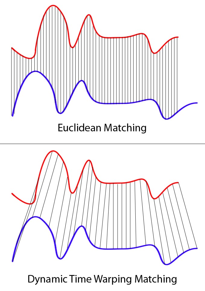
We'll compare each MFCC set to every other MFCC set using Dynamic Time Warping Matching (DTW). DTW is a strategy that allows us to compare feature sets of different sizes.
The result of each comparison is a distance value that represents how similar any two feature sets are. We'll store these values in a distance matrix.
# Create a distance matrix measuring the distance between each pair of beats' MFCCs
distance_matrix = np.full((len(mfccs), len(mfccs)), -1)
for i in range(len(mfccs)):
for j in range(len(mfccs)):
# If we are comparing a MFCC set to itself, distance is 0
if i == j:
distance_matrix[i][j] = 0
# If we haven't calculated the distance already, calculate it
elif distance_matrix[i][j] == -1:
distance = librosa.sequence.dtw(mfccs[i], mfccs[j])[0][-1][-1]
distance_matrix[i][j] = distance
distance_matrix[j][i] = distance
# Plot
plot_utils.heatmap(distance_matrix, figsize=(5, 5), title='Distance matrix', xlabel='Beats', ylabel='Beats', show_yticks=True)

A dark pixel at coordinate (x, y) indicates that beat x and beat y are similar. A yellow pixel indicates dissimilarity.
With this distance matrix, we can now use a clustering algorithm to group together similar beats. Let's try using hierarchical clustering.
import scipy.cluster
# Create hierarchical cluster of beats
condensed_matrix = scipy.spatial.distance.squareform(distance_matrix)
cluster_data = scipy.cluster.hierarchy.linkage(condensed_matrix, 'complete')
max_distance = cluster_data[:,2][-1]
# Plot
plot_utils.plot([0], figsize=(15, 5), title='Hierarchical cluster', xlabel='Beats', ylabel='Cut position', show=False)
ax = plt.gca()
ax.set_yticks([0, max_distance])
ax.set_yticklabels([0, max_distance])
scipy.cluster.hierarchy.dendrogram(cluster_data, ax=ax)
plt.show()

The above dendrogram is the result of our hierarchical clustering. It represents multiple clustering options; to get any single clustering, simply make a horizontal cut across the chart and observe which nodes are connected.
The question for us is- where should we make this horizontal cut? How many clusters should we choose?
One method of determining this is by looking at how the number of clusters changes as we change the position of our horizontal cut.
# Extract cluster distances from the cluster data
cluster_distances = cluster_data[::-1,2]
num_clusters = range(1, len(cluster_distances) + 1)
# Calculate the second differential line
second_diff = np.diff(cluster_distances, 2)
num_clusters_second_diff = num_clusters[1:-1]
cluster_quantity = np.argmax(second_diff) + num_clusters_second_diff[0]
# Plot
plot_utils.plot(
x=num_clusters,
y=cluster_distances,
title='Distance between cluster quantities (with second diff)',
xlabel='Number of clusters',
ylabel='Cut position',
show_yticks=True,
show=False
)
plt.plot(num_clusters[1:-1], second_diff, c='orange')
plt.axvline(cluster_quantity, c='black', ls=':')
plt.text(x=3.15, y=1100, s='<= Knee point at ' + str(cluster_quantity) + ' clusters', fontsize=14)
plt.legend(['Original', 'Second differential'], fontsize=14, framealpha=1)
plt.show()

The purple line in the above graph shows how the number of clusters changes as we move the position of the cut.
A popular method of determining a 'good' number of clusters is to look for the steepest slope change in this purple line. We can do this by locating the maximum value of the purple line's second differential (shown as the orange line).
This is known as a 'knee point'.
# For our chosen cluster quantity, retrieve the cluster pattern
pattern = scipy.cluster.hierarchy.fcluster(
cluster_data,
cluster_quantity,
'maxclust'
)
# Plot
multi_plot_utils.multi_plot(beats, title='', pattern=pattern)

Having chosen a cluster quantity, all that's left to do is determine which beats belong to which clusters. That's shown above where colors indicate clusters.
And it worked great! Our only misclassification is beat #32, the unintentional knock noise.
🥘 Part III: Beat replacement
We now know both where the beats are and what they represent. All that remains is to build a new track with similar sounding drums.
I've curated fifty drum sounds to choose from. For each beatbox sound, we'll run through these fifty drum sounds to determine which sounds the most similar using MFCCs and DTW.
import os
DRUM_FOLDER = 'assets/drums/'
# Get all drum kit file paths
drum_files = os.listdir(DRUM_FOLDER)
# Extract MFCCs from each drum kit sound
drum_sounds = []
drum_mfccs = []
for file in drum_files:
audio, sample_rate = librosa.load(DRUM_FOLDER + file)
mfcc = librosa.feature.mfcc(
audio,
win_length=WINDOW_SIZE,
hop_length=WINDOW_OVERLAP,
n_fft=1024
)
drum_sounds.append(audio)
drum_mfccs.append(mfcc)
# Create a map from beatbox sound classifications to drum kit sounds
beatbox_to_drum_map = {}
# Keep track of which drum sounds we've used to avoid repeats
drums_used = []
for beat_mfcc, classification in zip(mfccs, pattern):
if classification not in beatbox_to_drum_map:
# Find the drum kit sound most similar to the beatbox sound
best_distance = float('inf')
best_drum_sound = None
best_drum_file = None
for drum_sound, drum_mfcc, drum_file in zip(drum_sounds, drum_mfccs, drum_files):
# No repeats allowed
if drum_file in drums_used:
continue
# Calculate distance using previous DTW approach
distance = librosa.sequence.dtw(beat_mfcc, drum_mfcc)[0][-1][-1]
if distance < best_distance:
best_distance = distance
best_drum_sound = drum_sound
best_drum_file = drum_file
# Update drum map
beatbox_to_drum_map[classification] = best_drum_sound
drums_used.append(best_drum_file)
# Plot
drum_sounds = beatbox_to_drum_map.values()
for index, (drum_sound, spelling) in enumerate(zip(drum_sounds, ['pft', 'tss', 'khh'])):
IPython.display.display(IPython.display.Markdown('#### Drum sound for "' + spelling + '"'))
IPython.display.display(IPython.display.Audio(data=drum_sound, rate=sample_rate))
Great, we have our three drum sounds. Let's build the final output.
# Create 8 seconds of empty audio
track = np.zeros(sample_rate * 8)
# Add drum sounds to the track
for beat_start, classification in zip(beat_starts, pattern):
drum_sound = beatbox_to_drum_map[classification]
drum_sound = np.concatenate([
np.zeros(beat_start),
drum_sound,
np.zeros(len(track) - len(drum_sound) - beat_start)
])
track += drum_sound
# Plot
plot_utils.plot(track, title='Drum kit audio', xlabel='Time (samples)', ylabel='Amplitude')
IPython.display.display(IPython.display.Markdown('#### The final product!'))
IPython.display.display(IPython.display.Audio(data=track, rate=sample_rate))
IPython.display.display(IPython.display.Markdown('#### And the original again:'))
IPython.display.display(IPython.display.Audio(BEATBOX_AUDIO_FILE))

🎆 Conclusion

This project has been fun and the Beatbot algorithm works well!
A fined tuned version could potentially be useful as a tool in music production for amateurs or professionals looking to make quick beat mock ups.
To acheive a Beatbot algorithm that works even better, we'd probably want to use more recent, cutting edge speech processing techniques such as convolutional neural networks (CNNs).
Given an enormous unlabeled set of beatbox audio data (like 10,000+ hours), we could create better featurizations of our beats than MFCCs by using a strategy like
wav2vec.Wav2vecis a project that performs unsupervised training on a CNN with massive amounts of audio data, producing a fine tuned audio featurization model.Thanks for reading!
Feel free to email me at alexecrist@gmail.com with any thoughts on the project.
📚 References
- Photography: Inga Seliverstova
- Guide to MFCCs: http://practicalcryptography.com/miscellaneous/machine-learning/guide-mel-frequency-cepstral-coefficients-mfccs/
- Explanation of DTW: https://towardsdatascience.com/dynamic-time-warping-3933f25fcdd
- Explanation of 'knee points': https://stackoverflow.com/a/21723473/4762063
- Wav2Vec: https://arxiv.org/abs/1904.05862